Be yourself; Everyone else is already taken.
— Oscar Wilde.
This is the first post on my new blog. I’m just getting this new blog going, so stay tuned for more. Subscribe below to get notified when I post new updates.
Be yourself; Everyone else is already taken.
— Oscar Wilde.
This is the first post on my new blog. I’m just getting this new blog going, so stay tuned for more. Subscribe below to get notified when I post new updates.

For my cereal box design I chose to make Trilo-Bites a pun inspired by the extinct creature. I was inspired to do this as I had pictures of cookies I had made that looked somewhat like them. In order to create the cereal I color adjusted cookies that were originally green and pink to be brown and shrunk them down to be cereal shaped. I chose to stay with a mostly neutral color scheme with browns, tans and greys and the green background because I wanted it to seem natural and earthy. I chose the title font I did because it reminded me of erosion and fossils. I made the back of the box a hidden object search as it went along with the idea of looking for and finding fossils. I really liked the way my project turned out. I think I did a good job of making everything look cohesive and not too busy or spaced out. One thing I would change if I redid this is I would resize circles and cereal on the furthest right panel and possibly add more text on that panel. I also would have liked to have my find the fossils graphic look more cohesive but I had a hard time finding images of fossils that looked similar. Another thing I would change is I would work to make the cereal color lighter, I had a hard time getting them to be a good color. I think the contrast between the cartoon images on the back and the realism on the actual cereal help bring the piece together. I would market this cereal to people interested in science of all ages. Overall I really liked the assignment and my finished product.

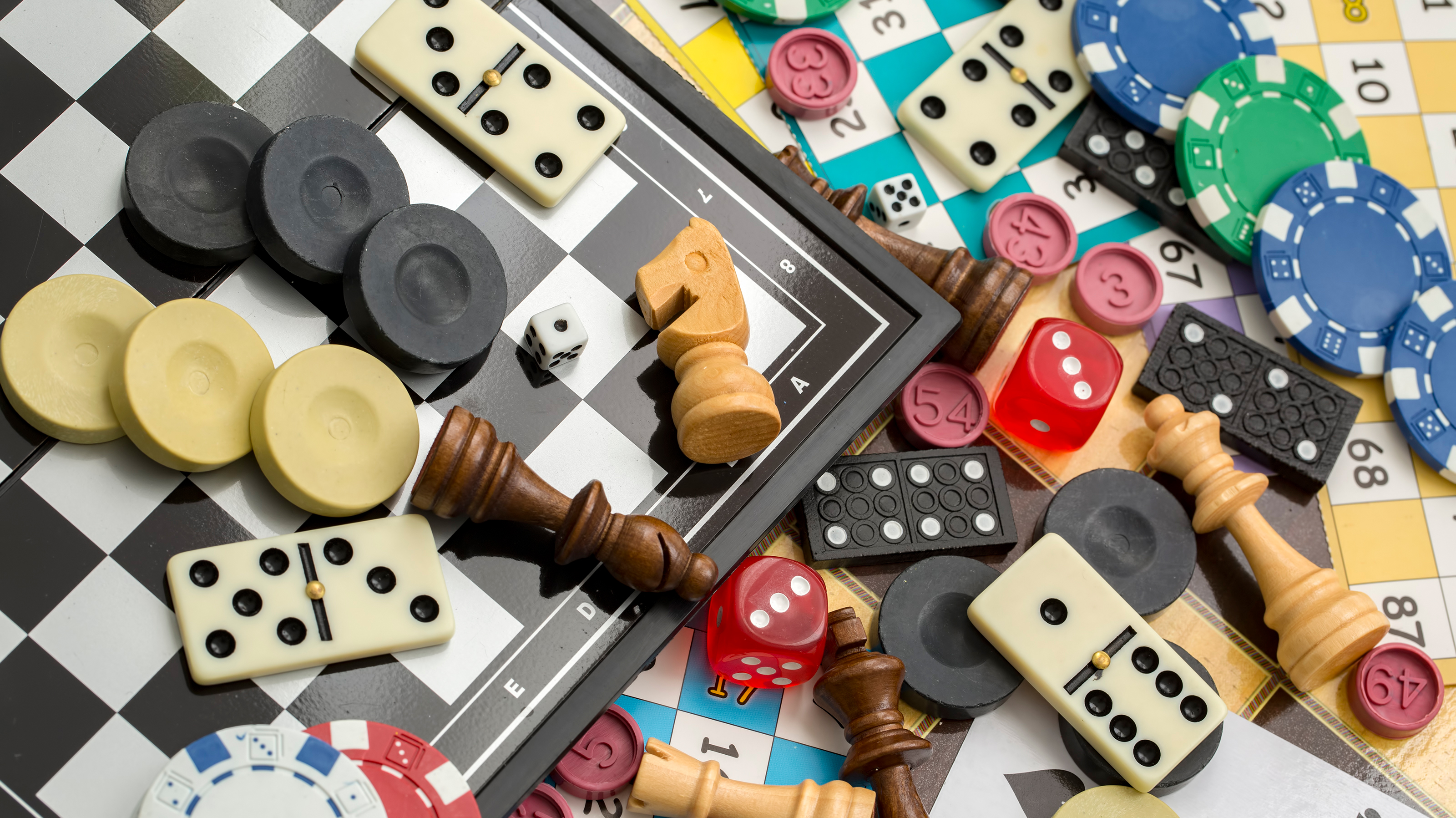
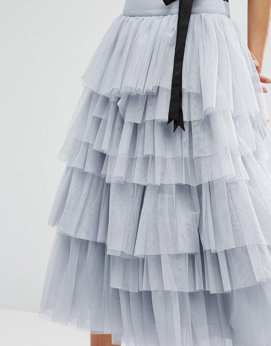
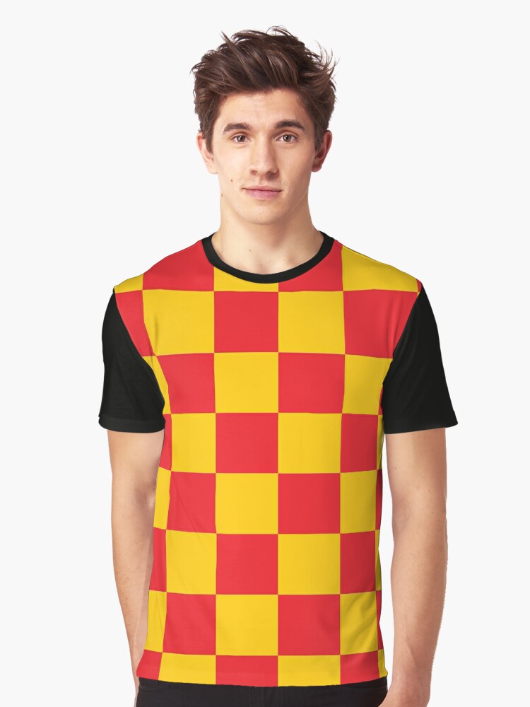


My design was inspired by card and board games. I really liked the idea of the cards making layers on a tiered skirt so I designed it around that. I tried to keep it within the same color scheme so that it would look cohesive even though board games have many more cards than this. I added x’s and o’s on the bodice to represent tic tac toe and added game pieces on squares on the fronts of the sleeves to represent a game board. I added the red and yellow checker pattern as it reminded me of Connect 4, Chess and Checkers. I did not want to keep my look only red and black as I didn’t want to appear too similar a Queen of Hearts dress. I also added game pieces to both the headpiece and made them into earrings to match. This is probably one of my art pieces that went through the most revisions or changes before the final piece. I really liked the way it turned out and was happily surprised with the results, as drawing anatomy is difficult for me. The target audience was for some elaborate gala or costume party as the design is not at all practical for everyday use. One thing I really liked that I did in this project is that there is some asymmetry which I don’t use often as I like things to match. Overall I think this was a good project and that I got out of my comfort zone and created a product I liked.
For my Hero project I chose Hank Green for the subject. He is an educator who works to inform and help high school students to learn along with his brother through Crash-course videos. He is also the author of two books along with having a podcast talking about real world issues and giving advice. I chose to use the stone blue lapiz in my collage as it universally represents wisdom as he is an educator. I used the stone black jade as well as it represents power, creativity and wisdom which he displays through his all of his published works and educational videos as he is a strong influence. I chose to use green jade as it represents happiness in family as Hank works hand in hand with his brother on many of their projects. The stone fluorite is also included in my collage as it represents lateral and outside of the box thinking which we can see Hank apply to his videos and other works. Finally I chose turquoise to represent money and success as Hank has become very a prevalent youtuber along with founding Vidcon along with his brother. I tried to make the collage as symmetrical as horizontally symmetrical as possible while vertically adding in different elements behind and in-front of the piece. I chose a maroon colored background as it is opposite the green and blue tone found in rocks on the color wheel making them stand out better. Overall I like the way it turned out, although I struggled with making sure everything was symmetrical without guidelines.

(Final piece will be added tomorrow)
My piece is a Christmas tree made out of Christmas ornaments. I was inspired to make this piece as ornaments are a consistent shape and have a large range of colors, making them a good object to create with. I decided to make the ornaments of varying size and give the tree and gradient shading to add dimension and variety. A struggle I had is that circles are not very geometric shape and are hard to fit in with each other due to their smooth and symmetrical shape making there be odd sized gaps between some of the ornaments. I also had trouble choosing which size bulbs to put where in order to create an equal distribution of the different sized ornaments. I worked through this by changing some of the bulb sizes to fit better. I also found a picture of a pine tree to put in the background so that I could make sure I was creating the general shape I was going for. I want people to feel joy when they look at my project, as it reminds me of the holidays. I would recommend to anyone doing this project that they should use shapes that interlock well with each other as this would make spacing more efficient. If I were to redo this project in the future I might have made the ornaments different sizes or added additional objects to piece to help balance out spacing of the circles.
The large part of my project is finished at this point, I have been limited to the time I have been able to work on my project due to the fact I can only work in class on Mondays. I have not added anything to my project since the last class. The work I have left to go is changing the color of some of the ornaments to create a Christmas tree, adding a trunk and a star and changing the background to a more appealing color. I should be able to complete the assignment without the extra class time Thursday. It would be helpful though if you made it officially due on Wednesday so I could use any extra time on my a-sync day to work on it.


I added a new color section of green to the tree I’m creating. I was wondering if the spacing was adequate or if there is a way to make it more even.
So far I have gotten all my images and figured out how to open, duplicate and resize on photoshop. I have started creating the Christmas tree out of ornaments.


My project proposal is making a Christmas tree with presents under it out of Christmas ornaments. I plan on varying the size, and color of the ornaments to create the colors and shapes needed for the scene.


Have a WordPress.com account? Log in now.

